Font Matters
Choosing the Right Font
Have you considered what your website may be saying to visitors? 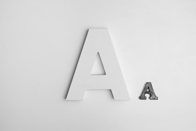
Apart from the content a website contains, human communication includes a great deal of subtle complexities too, and so your website may be saying more than you have thought.
Colour, images and layout all contribute towards the message your website conveys, you can instantly gain a perception of a Church through its website. It is beneficial to spend a good amount of time considering the impression that you would like your website to have.
One of the biggest impacts on the character of a website, which is easily overlooked, is that of the chosen font.
When dealing with a visual medium, all visible elements contribute to the expression of the message trying to be achieved. Just like when we meet a person for the first time and their body language communicates more to us than their actual words, the typeface that is used on a website expresses the underlining disposition of the message that those words carry.
Unawareness of how much influence visual subtleties affect what we are trying to communicate leads to a disconnected message, and when dealing within a visual space, that first impression could either lead visitors in further or push them away.
Consider two leading UK newspapers, The Times and The Guardian. Both understand the substantial weight that a typeface carries in reinforcing its values and distinct voice, so much so that both have their own unique font families, the Times New Roman family and the Guardian family of fonts.
It is important to choose your typeface carefully, rather than randomly selecting a font that you like the look of. For example, should your message be one of authority, then the use of Comic Sans will completely undermine the stature of your text. An authoritative message should be accompanied by a font of equal weight. Just as a website that would like to promote a welcoming atmosphere should stay away from fonts such as Times New Roman, in favour of a more rounded and open font.
When deliberating the font for your website, consider the overall tone that you want the visitor to encounter throughout the website, rather than each piece of written content. At most, a website should contain no more than 3 font variations which compliment each other rather than fight for attention. For example, use a Serif alongside a Sans-Serif font rather than two variations of Serif fonts together. This simplicity will provide clarity and cohesiveness rather than chaos to your overall message.
Within Church Edit’s website platform, you will find a selection of fonts which are suitable for screen use. These are established and widely recognised fonts, ensuring that your text will be legible across a wide variety of computers and internet platforms. Church Edit makes it easy for you to get the best from your website.